MY ROLE:
- Designer
YEAR:
2016
COLLABORATED WITH:
- University of Cincinnati, College of Design, Architecture, Art, and Planning
- Cincinnati Children’s Hospital Medical Center
Introduction
The goal of this project is to improve the existing U.S. Pharmacopoeia Icon System and refine icons to significantly reduce rates of making mistakes by medical workers. The project follows a design thinking process as demonstrated in Fig. 1 below.
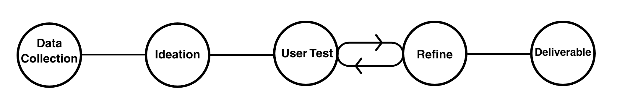
Fig. 1. The design process of the project.
Three icons were created in this case study that represent the following meanings.
- Drugs that require airway administration
- Concentrated Electrolyte Formulation
- Drug names that look-alike and sound-alike
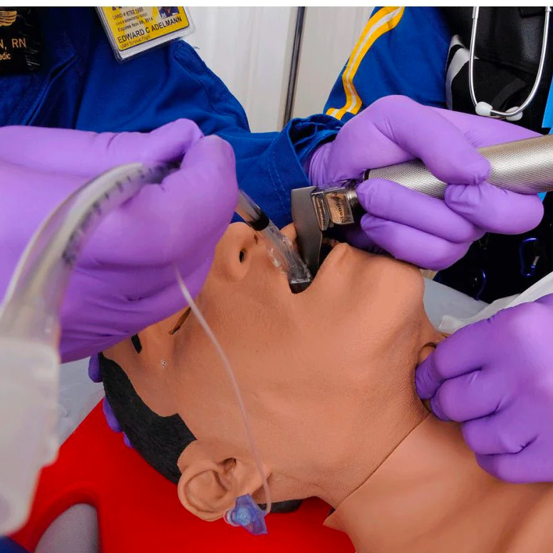
Drugs that require airway administration [1]
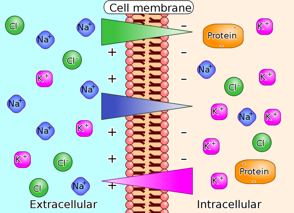
Concentrated Electrolyte Formulation [2]
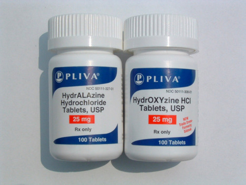
Drug names that look-alike and sound-alike [3]
Image sources:
- [1] https://www.gtsimulators.com/products/learning-module-airway-management
- [2] https://en.wikipedia.org/wiki/Electrolyte_imbalance
- [3] https://www.psqh.com/analysis/look-alike-drug-name-errors/
Data Collection
Phase 1. Survey
Participants (medical workers) were asked to write down the keywords that come to their mind about each topic.
The keywords that have top rate for each topic:
- Drugs that require airway administration: throat, airway, breathing, mouth, nose, face
- Concentrated Electrolyte Formulation: “+”, “-“, ion (Na, K, Cl)
- Drug names that look-alike and sound-alike: eye, ear, similar words
Phase 2. Draw-it Activity (Co-creation)
Based on what we got from the first survey, a co-creation session was conducted. The participants were asked to draw what was described in each question.
Ideation and Testing
Expert Feedback
Depending on the keywords and drawings from the participants, we developed our first drafts of design and sent them to the pharmacists for the first test. The following is their feedback.
Drugs that require airway administration
Feedback: “The hand is a good idea. The tube should not be as long coming out of the mouth. Do not put the separation between the airway to the lungs and esophagus.”
Concentrated Electrolyte Formulation
Feedback: “Important electrolytes are: Ca2+, My2+, K+. Do not put H+, Na+, or Cl-. A syringe would be better. “
Drug names that look-alike and sound-alike
Feedback: “Take off the “+” and add on the upper left of the container an Rx.”
Refinement and Tests
All the refined icons of each topic were sent to the pharmacist group for the test. The top 1st choice and the second top 1st choice for each category was selected for further development.
Drugs that require airway administration
Comments:
- Improve anatomical features and show a clear alert/indication (equipment) for airway management (depicting an open airway or a clear air passage to the lungs).
- Differentiate from feeding tube
- I’d put a question sign above
- Pictograms C – E are okay by me. However, a and b are not too clear to me.
- The more simple the pictogram, the better. That’s why A is my first choice.
- The circle in the picture d should contain the symbol of a medication. It will make d the preferred choice.
- A filled syringe added to pictogram D
- Image 1&2 need to be bolder. its quite faint
Concentrated Electrolyte Formulation
Comments:
- Although some electrolytes can be administered intravenously undiluted, most aren’t. Would avoid depicting concentrated electrolytes in a syringe which may imply direct injection.
- Use of container other than syringe
- I would rather make the content of E to appear denser, depicting more concentrated.
- I do not like how the electrolytes are written out. If the medication is concentrated potassium, the pictogram makes it look like it also contains the other electrolytes in the pictogram.
- The a and b option is good if the have the electrolyte sign in the shaded portions
- I would avoid the use of chemical symbols – could cause confusion
- Instead of multiple electrolytes single electrolytes can be used eg. Na+ alone
- Show a vial with a red high alert sign (a triangle) accompanied by written words ‘electrolyte concentrate’ or ‘concentrated electrolyte formulation’.
- This one is very difficult. E is probably simplest
Drug names that look-alike and sound-alike
Final Design
After another refine-test practice, we came up with the final designs. My work for “medication that requires airway management ” and “medications that look-alike and sound-alike” were included in final deliverable.